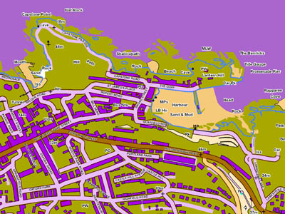
How a colour-blind friendly map would look to someone without the disorder
Britain’s national mapping agency has introduced a new product to help people who are colour-blind read maps more easily.
Conventional maps can cause problems for up to eight per cent of the population – mainly men – who have difficulty distinguishing between certain colours. Now Ordnance Survey has come up with a solution that can be used by those who produce mapping for their customers, such as companies and public authorities.
Colour blindness is caused by an anomaly in the pigmentation of ‘cone’ receptors in the eyes of those who have the condition, and leads to colours being rendered differently in those who have the condition, which is mostly inherited. Only one per cent of women are colour-blind.
The traditional rainbow of cartographic colours – green for grassland and trees, red for main roads and public footpaths, and blue for motorways and rivers – can become indistinguishable, therefore making map reading extremely difficult.
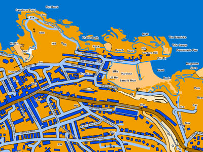
The new OS digital mapping system can be customised to make if more friendly for people who are colour-blind. The agency says this produces maps that, to people with normal colour vision, may look odd but are much more easily read by those with colour-blindness.

How the map would look to someone with colour-blindness
OS spokesman Paul Beauchamp said: “Cartography is a fine art, but the colours that have become so familiar to most of us are actually among the worst possible choices for those with colour blindness. By using our new mapping product, called OS VectorMap Local, councils and businesses will be able to create styles especially for colour-blind people that we hope will make life easier.”
Colour blindness is a bar to many jobs, including airline pilots, coastguards and train drivers.